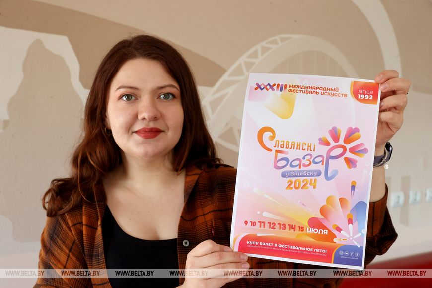
Tradition and innovation: new style of Slavianski Bazaar in Vitebsk 2024
The style of the 33rd Slavianski Bazaar in Vitebsk International Festival of Arts combines traditional cornflower colours and new bright shades, with the festival’s directorate revealing how posters of the upcoming arts forum would catch fans’ attention, BelTA reports
For the upcoming creative season of the Slavianski Bazaar in Vitebsk festival, the logo and its colour scheme have been updated. The creator of the visual content was Yulia Kryuk, an art-designer of computer graphics of the Vitebsk Cultural Centre design department.
“In 2023, we experimented, gave our artists some rest, and we had a competition. This year, it was probably an impetus for Yulia to come up with her own style. When she presented her ideas to us, at first we thought it looked a bit naive and childish. However, after close examining, we realised that it conveys the depth of the project that has existed for 33 years. For the first time in all these years, the font of the inscription has been modified, becoming more modernised,” the Director General of the Vitebsk Cultural Centre and Director of the Slavianski Bazaar in Vitebsk International Festival of Arts, Gleb Lapitsky, stated.
The basis of the recognisable logo is the cornflower colour already familiar to festival fans. It is complemented by bright orange, pink, and yellow colours, which seem to flow into each other and create an eye-catching gradient.
“Each stage has its own mood, its own colour. When creating a new style, I focused on this variety of directions and emotions. It will become easier for the viewer to make distinctions, because the festival is big, and has many components in it. The brightest and most intense programme is in the Summer Amphitheatre, so it has the most multi-coloured poster. Our classic blue version is a more intimate setting, this is the Vitebsk Concert Hall and the open area in front of it – there is a lot of air, a lot of sky, so we chose these shades,” Yulia Kryuk noted.
According to the designer, the pink tones of the corporate style may be safely attributed to the children's audience, the Lyalka Belarusian Theatre, with its intimate, almost home stage.
“We have never addressed the topic of weaving before. Now we consider the cornflower not as a unit, but as a component of something big. Each artist is like an element that is woven into our festival wreath. We used elements of weaving in the logo too. The graphics correspond to modern trends, which we try to reveal in our theme. And we did not want the graphics to be too intense, because it only complements the artists of the festival, uniting them into a common picture,” the designer of the new visual concept added.
The festival directorate took the combination of tradition and innovation as a basis, but also considered other aspects, “The new style is primarily about emotions, which the Slavianski Bazaar carries in itself. A person gets to the festival, explodes with sensations, and while this bright colour burns in them, they live with these emotions until the next festival. Probably, this is the specificity of the style, because it is invented by a person from the inside, who can convey the mood of the festival through visualisation,” Gleb Lapitsky emphasised.
He noted that the full programme of the festival will soon be presented, and fans of the arts forum can expect many surprises, ranging from new children's projects, such as Guests from the Future, which will be held in the Summer Amphitheatre, to elitist art – for the first time in Vitebsk, jazz will be performed on the organ.


